
Numbers Don't Lie, But They Don't Talk Much Either
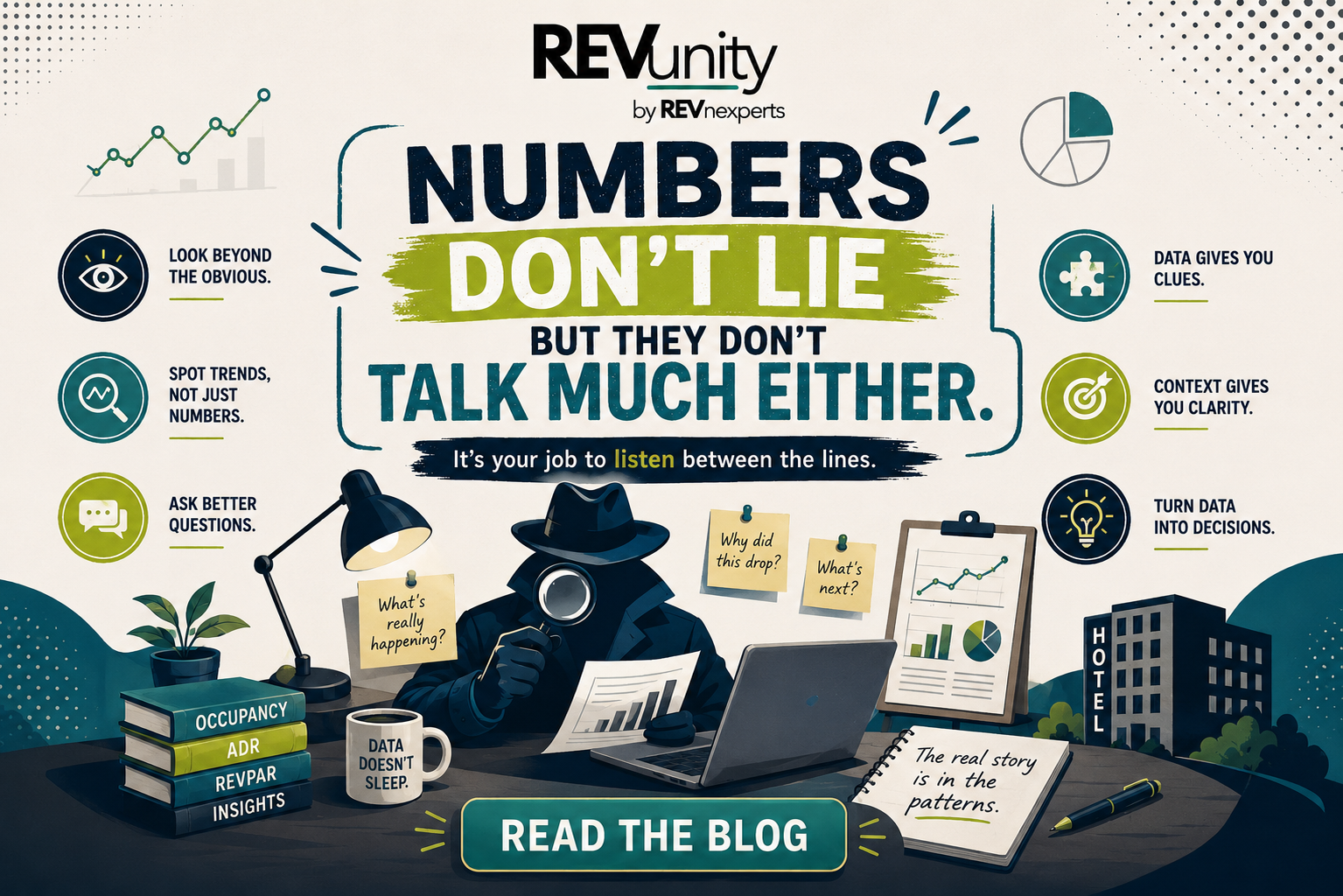
That's the quiet, slightly embarrassing problem sitting at the center of most hospitality reporting: numbers don't lie, but they don't talk much either. A spreadsheet can tell you occupancy dropped three points last month with total confidence. What it won't do, no matter how long you stare at it, is tell you why, whether it should worry anyone, or what to actually do about it on Monday morning. That part is entirely up to the person reading it, and it takes a habit that most teams, frankly, haven't built yet.
Data Without Context Is Just Very Well-Formatted Noise
Hospitality generates more data than almost any other service industry on the planet, and it never really stops. Property management systems, OTA channels, point-of-sale terminals, guest satisfaction surveys, loyalty programs, weather feeds, local event calendars, all of it updating in real time, all of it exportable, all of it sitting there looking important. That volume creates a comforting illusion: surely, with this many numbers on the screen, the decision must be well-informed.
In practice, the opposite is usually closer to the truth.
A dashboard crowded with forty metrics can bury the one number that actually matters under thirty-nine that don't. More data doesn't automatically create more understanding. Past a certain point, it just creates more to scroll past on the way to the coffee machine
Think of it like a hotel lobby at Christmas, the more decorations you add, the harder it becomes to notice the one guest standing at the desk who actually needs help. Clarity, not volume, is the whole point of a dashboard. A property that tracks fewer metrics well will consistently out-decide one that tracks everything loosely.
Every Number Is Really the Opening Line of a Story
The most useful shift a revenue or operations team can make isn't a new piece of software, it's a new habit: treating every metric as the opening line of a story, not the whole story. A number on its own is simply a fact, sitting there, minding its own business. A story is what explains why that fact happened and what it actually means for the business. One is trivia. The other is strategy.
A simple structure helps build that story, one honest question at a time, in an order that resists the temptation to jump straight to conclusions:
Start With What the Number Actually Says
Before interpreting anything, resist the urge to editorialize and simply state the fact. Occupancy was 68% in July. ADR rose 4% quarter over quarter. Guest satisfaction scores dipped half a point. No cause, no spin, no dramatic music.
Just the fact, stated cleanly, so everyone in the room is looking at the same starting line before anyone starts running with it.
Ask Why It Should Matter to Anyone in the Room
A number only earns a place in the conversation once its significance is clear. A small dip in occupancy might be entirely unremarkable on its own, a shrug, a footnote but if it follows three straight months of growth, or lines up neatly with a competitor's grand opening two blocks away, it suddenly deserves the room's full attention.
Dig Into Why It Actually Happened
This is usually where good reporting quietly stops, and where great reporting properly begins. A seasonality chart that looks identical every single year for the overall market can be hiding a completely different pattern the moment you filter by guest segment, source of business, or region. Corporate travel might dip hard in summer while leisure guests surge in the same window. Domestic guests might book on entirely different timelines than international ones, for reasons that have nothing to do with the hotel itself and everything to do with school calendars, weather, or currency swings back home.
The average tends to flatten out the very pattern that would explain the number in the first place, which is exactly why segmenting the data, rather than reading it in aggregate and calling it a day, tends to surface the real story hiding underneath the more boring, blended one.
Decide What to Actually Do Next
Only once the reason is genuinely understood does a number become something you can act on rather than simply admire. If a small slice of guests is quietly generating a disproportionate share of revenue, that reshapes where marketing spend and service investment should go next quarter. If a dip in direct bookings tracks suspiciously well with a change in a particular channel's commission structure, that's a conversation for procurement, not just a red arrow on next month's slide.
Good Data Habits Worth Building Into the Weekly Routine
None of this demands a dedicated analytics team, a six-figure BI platform, or a PhD in statistics tucked away somewhere on the org chart. It demands a handful of habits, applied consistently and a little stubbornly, before any conclusion gets written down and treated as fact.
● Define every metric in one plain sentence and keep that definition parked right next to the dashboard, not floating somewhere in one manager's memory.
● Compare over time, not just against last month. A single snapshot rarely tells you whether something is a genuine trend or simply a Tuesday.
● Segment before you conclude. Averages are soothing, but they're also exactly where the most interesting patterns tend to go into hiding.
● Cross-check the source. A number pulled from a PMS, a channel manager, and a spreadsheet export don't always mean the same thing, even when the label on the column looks identical.
● Separate the fact from the interpretation. State what happened first, and only then discuss why blending the two too early tends to produce confident conclusions that quietly don't hold up under questioning.
Why the Fine Print Behind a Term Matters More Than It Seems
Hospitality data is full of terms that sound perfectly interchangeable and, quietly, are not. A visitor and a guest are not the same population one simply arrived somewhere, the other actually stayed the night and used the pillows. Occupied rooms might or might not include complimentary stays and day-use bookings, entirely depending on how a property's system happens to be configured. Direct bookings might or might not include a phone reservation that a walk-in guest ultimately converted at the front desk five minutes later.
None of these are trick questions designed to catch anyone out they're simply definitions that everyone quietly assumes are shared, right up until a decision gets made on the wrong basis and someone has to explain why the numbers didn't add up. A five-minute terminology check before a meeting starts costs almost nothing. A decision built on a misunderstood metric can cost considerably more, usually at the worst possible moment.
Let the Data Be Interrogated, Not Just Displayed
Static reports have a fixed personality: they answer only the exact question they were built to answer, and not a syllable more. A filterable, live dashboard, by contrast, lets a revenue manager or operations lead ask a follow-up question the instant it occurs to them, why a particular segment behaved so differently in a particular month, say — without waiting patiently for next quarter's export to land in an inbox.
The easier a dashboard is to poke, prod, and filter, the more likely a team is to actually interrogate it, rather than glance politely and move on to the next slide. A dashboard that invites questions tends to get used. One that merely displays answers tends to get ignored, however handsome it looks doing it.
Bringing the Story Back to the Property Floor
The instinct to explain a number instead of simply reporting it is a habit, not a rare talent handed down to a lucky few, and it's one that any hospitality team can build, regardless of size, budget, or how many logos are on the software stack.
Why it matters: A dashboard full of perfectly accurate numbers can still steer a team toward the wrong decision, if nobody in the room ever stops to ask why those numbers look the way they do. The strategy was never really in the chart. It was always in the story behind it.
Where to apply it: Monthly performance reviews, seasonality planning, source-of-business analysis, guest experience scoring, and marketing spend decisions all benefit from the exact same discipline, clear definitions established up front, and one genuinely curious question asked before any conclusion is allowed to harden into fact.
Frequently Asked Questions
Why is data storytelling important in hospitality?
Hospitality generates large volumes of data across bookings, guest scores, and revenue systems, but raw numbers don't explain themselves. Data storytelling connects individual metrics to the reasons behind them, turning a report into a decision-making tool rather than a status update read aloud in a meeting.
What's the difference between reporting data and reading data?
Reporting states what a number is. Reading data asks why it looks that way, whether it actually matters, and what should happen next as a result. Most teams are quite strong at the first step and noticeably weaker at the remaining three.
How can a small hotel team build better data habits without an expensive BI tool?
Start with clear, written definitions for every key metric, compare numbers over time rather than in isolation, and segment data by guest type or channel before drawing any conclusions. The discipline matters far more than the software sitting underneath it.